Learning how to read a stock chart felt like staring at a foreign language the first time I opened one. Red and green blocks, thin little lines poking out the top and bottom, a smaller bar chart squished underneath — none of it meant anything until someone actually walked me through what each piece was doing. Once it clicked, it clicked fast, and I’ve never looked at a stock the same way since. Here’s the version I wish someone had given me on day one.
What you’re actually looking at
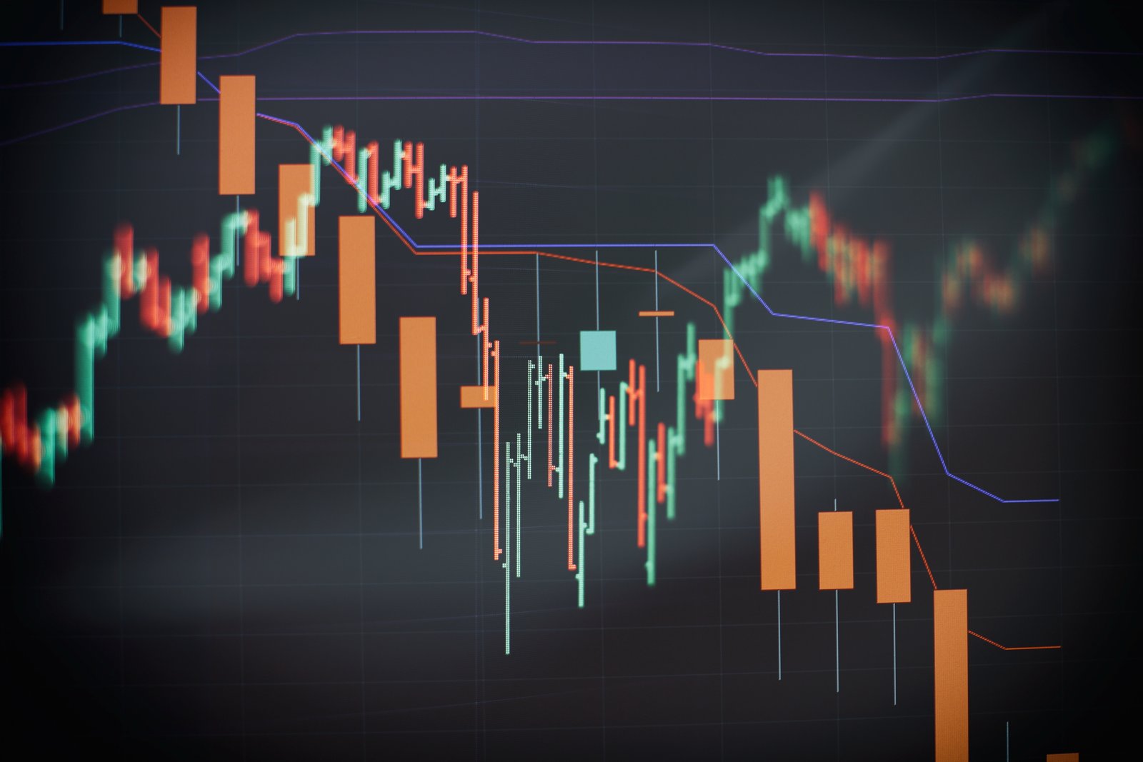
Most charts you’ll run into use candlesticks, and each one represents a single chunk of time — a day, an hour, five minutes, whatever timeframe you’ve selected. The thick part of the candle (the “body”) shows where the price opened and closed during that period. If the close was higher than the open, the candle is usually green (or sometimes white/blue); if it closed lower than it opened, it’s red. That’s really the whole foundation — everything else on the chart is context layered on top of that one basic building block.
How to read a stock chart: the parts at a glance
The X and Y axes: price and time
Knowing how to read a stock chart starts with the axes: the vertical axis (usually on the right) is price. The horizontal axis is time, and this is the setting most beginners overlook — the same stock can look like it’s crashing on a 5-minute chart and calmly climbing on a weekly chart, because you’re looking at completely different slices of its history. Before reading anything into a chart’s shape, always check what timeframe you’re actually looking at first.
Wicks: the part people usually ignore
The thin lines above and below the candle body are wicks (or shadows), and they show the highest and lowest price reached during that period, even if price didn’t close there. A candle with a long wick on top and a small body tells a different story than a candle that closed right at its high — the first suggests buyers pushed price up and then lost control, the second suggests buyers stayed in charge through the close. Reading wicks is honestly where chart reading starts to feel less like memorizing shapes and more like understanding what actually happened during that candle.
Volume: the bar chart underneath
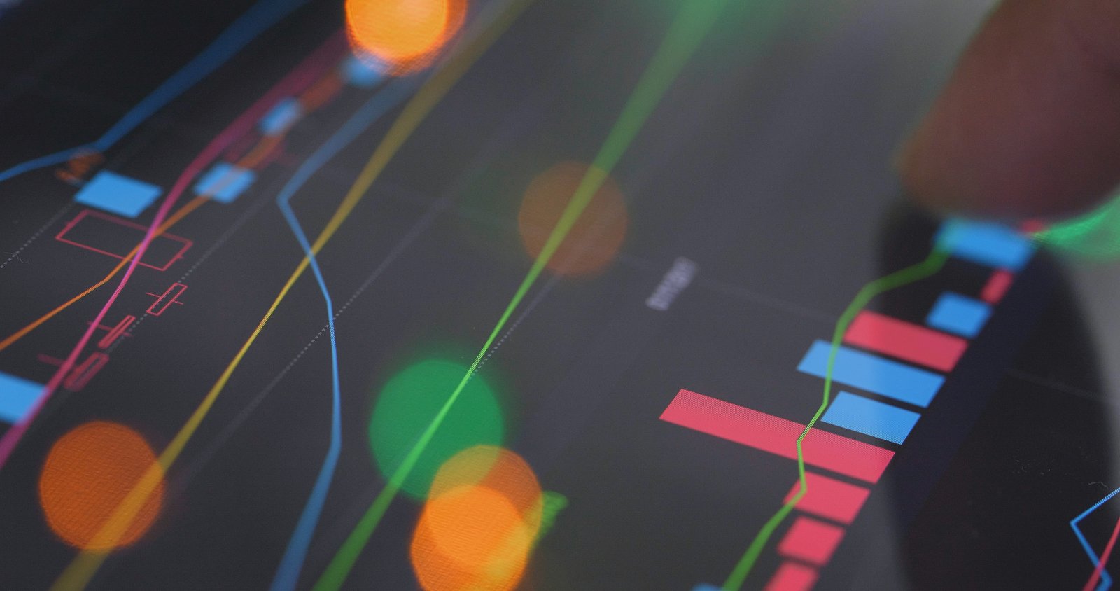
A big part of how to read a stock chart well is looking past the candles: almost every chart has a second, smaller bar chart sitting right below the price candles — that’s volume, and it’s the number of shares that actually traded during each period. Volume is what separates a meaningful move from noise. A stock jumping 5% on huge volume suggests real conviction behind the move; the same 5% jump on unusually light volume is a much weaker signal and more likely to reverse. Whenever a chart pattern looks convincing, checking the volume bar underneath it is the fastest gut check for whether it’s worth trusting.
Trend lines and support/resistance
A trend line is just a straight line connecting a series of swing highs or swing lows, and it visualizes the general direction price has been moving in. Support is a price level where a stock has repeatedly stopped falling and bounced back up; resistance is the mirror image — a level where rallies keep stalling out. Neither is a guarantee price will behave the same way next time, but they mark the zones where previous buyers and sellers have already shown up in meaningful numbers, which makes them worth watching.
Picking the right timeframe for what you’re doing
Part of how to read a stock chart correctly is matching the timeframe to your strategy: a day trader watching 1-minute or 5-minute candles is looking at a completely different picture than a long-term investor glancing at a weekly chart once a month, and that’s exactly how it should be — the timeframe should match your actual time horizon. Zooming into a 1-minute chart to make a decision about a stock you plan to hold for years just adds noise; zooming out to a weekly chart to time a same-day trade misses the moves that actually matter for that trade. If you’re not sure which timeframe to use, start with a daily chart and zoom in or out from there once you know your actual strategy.
Tools that make this a lot easier
Chart reading works best alongside company research. Investor.gov explains that researching investments is part of an investor’s due diligence, so use price action as context rather than as the whole decision.
You can absolutely learn to read charts on a free tool, but a platform built specifically for charting makes the whole process faster — drawing trend lines, switching timeframes instantly, and layering indicators without fighting a clunky interface. We use TradingView for exactly this reason; it’s become close to the industry standard for a reason, and their free plan is more than enough to practice everything covered in this guide. If you want a head start on turning chart-reading into an actual strategy rather than just recognizing shapes, our pre-market research checklist walks through how to combine chart reading with the broader context that moves a stock.

A simple way to practice
The best way to practice how to read a stock chart is hands-on: pick five stocks you already know something about and pull up their daily charts. Before looking at any news or analyst opinions, try to describe what the chart is telling you in plain language: is it trending up, down, or sideways? Where’s the nearest support and resistance? Does recent volume support the direction it’s moving? Then go check the news and see how closely your read matched what was actually happening. Do that with a handful of stocks a few times a week, and pattern recognition starts building a lot faster than reading about it ever will.
FAQ
Do I need to pay for a charting platform to learn this?
No — free tiers on platforms like TradingView or even the charts built into most brokerage apps are enough to learn everything in this guide. Paid tiers mostly add convenience and extra indicators, not fundamentally different information.
What’s the difference between a candlestick chart and a line chart?
A line chart only plots the closing price for each period, connected into a single line. A candlestick chart shows the open, high, low, and close for each period, which is why most active traders prefer it — it’s simply more information in the same space.
How long does it take to get comfortable reading charts?
Most people grasp how to read a stock chart within a few hours of active practice. Getting fast and intuitive at it — reading a chart at a glance the way a fluent reader skims a sentence — usually takes a few weeks of regularly looking at real charts, not just reading about the theory.
Should I use candlestick patterns like “doji” or “hammer” to make decisions?
Named candlestick patterns can add useful context, but treat them as one input among several rather than a standalone signal. A hammer pattern showing up at a level with strong volume and near known support tells a more complete story than the same pattern in isolation.
Some links on this page are affiliate links. If you sign up through one, we may earn a commission at no extra cost to you.